 Some notes on composition from Brenda Tharp's workshop
Rather than giving us a lesson on composition, she wove the information through the first critique on Friday morning. We each submitted 6 photos taken before the workshop, and she reviewed them with us in a group session. It could have been nerve-racking - putting our work out there for a professional to, basically, tear apart - but Brenda is very thoughtful and direct.
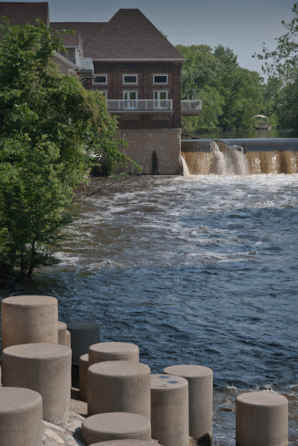
The first thing she zeroed in on was "bulls eying", the tendency we have to put the subject smack in the middle of the frame. It makes for a very static picture. She reminded us about the "rule of thirds", which means dividing the frame into thirds horizontally and vertically, and placing the subject roughly where the lines intersect. She cropped some one's bulls eye shot to follow the rule, and it made a dramatic improvement in the photo. Brenda was adamant about splitting the frame in half, vertically or horizontally, because it just stops the eye. Move the horizon or strong lines out of the center to allow the eye to flow through the photo.
Visual clutter is a bad thing in a photo. It distracts from the subject and makes it hard for the viewer to understand what the photographer wants to convey. She suggest using depth of field to isolate the subject from a busy background. This is one of Chuck's favorite techniques: get the subject really sharp, and blur out the background.
Brenda told us to simply, even in big landscapes. This is something I have a trouble with. My landscape shots are just a mess of everything I see, so there's no real subject to catch your eye.
Another interesting thing she noted is that we generally look at pictures from left to right, top to bottom. It's easier for the viewer if you set up your composition to be "read" that way.
Brenda had more good information on composition, but I think I'll save it for another post.


 I love the CVPS photowalks. I learn something everytime (like there's something to shoot even on a rainy day), the people are nice, and the chat over breakfast is always interesting.

